Introduction
Diodes Incorporated (Diodes) produces a wide variety of printed and digital pieces of communication every year. These guidelines have been created to ensure that there is consistency and clarity for each of them.
Our corporate identity is very important as it differentiates us from our competitors. It represents our personality as a modern, forward looking company.
Please help us by following these guidelines so that Diodes can communicate its messages effectively at all levels.


This is a PNG file and is suitable for use on PowerPoints / Word docs etc.
To receive a high-resolution logo contact marcom@diodes.com
1.0 The Diodes Incorporated Logo
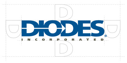
The corporate logo consists of the word 'DIODES' in blue lettering and containing the ‘diode symbol’ arrow from the initial ‘D’ to the beginning of the second ‘D’ on the logo.
The registered trademark symbol, ®, appears to the right of the blue lettering. The registered trademark is not used in logos appearing in China.
The word ‘INCORPORATED’ is featured underneath in grey.
When using the Diodes logo, add the following footnote: The Diodes logo is a registered trademark of Diodes Incorporated in the United States and other countries.
To access logo specifications, usage, preferences and digital artwork contact: marcom@diodes.com

1.1 Areas of Isolation
The corporate logo must always be separated from competing graphic elements.
The logo should always be surrounded by an amount of clear space at least equal to the height of the letter ‘D’.
1.2 Minimum Size
To maintain legibility the logo shouldn’t be used below the following minimum sizes:
Print: 20mm width
On-screen: 100 pixels width.
1.3 Monochrome Logo
Where possible the color version of the logo should be used. If due to the limitations of printing this isn’t possible a monochrome version should be used.
When monochrome is used, then all elements are to be 100% black.
This form of the logo must only be used against background colors light enough to hold enough contrast to maintain legibility.
This is a PNG file and is suitable for use on PowerPoints / Word docs etc.
To receive a high-resolution logo contact marcom@diodes.com
1.4 Logo Use on Dark Backgrounds
When the corporate logo is used on a dark background the logo and text is inverted to white as shown.
This form of the logo must only be used against background colors that are strong and dark enough to hold enough contrast to maintain legibility.
All other logo rules apply when the logo is used on a dark background.

This is a PNG file and is suitable for use on PowerPoints / Word docs etc.
To receive a high-resolution logo contact marcom@diodes.com


